


The Role of Graphics and Branding in Trade Show Display Design
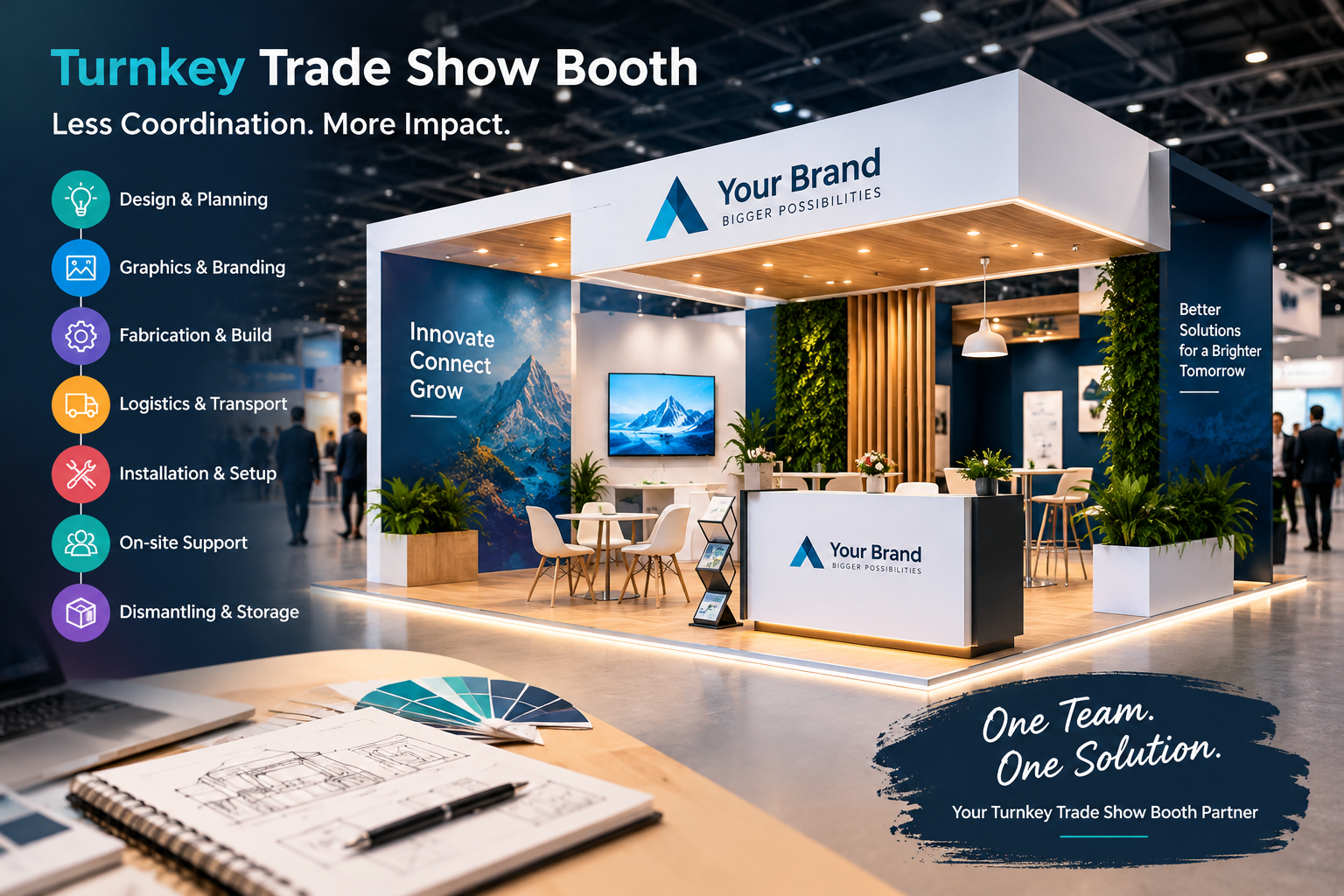
A trade show booth has only a few seconds to capture the attention of people walking through a busy exhibition hall. Strong visuals, clear messaging, and recognizable branding can make that first impression more effective. A well-planned trade show display design combines structure, graphics, colors, typography, and brand elements to create an environment that communicates what a company offers. While booth architecture provides the foundation, graphics and branding give the exhibit its personality and help visitors quickly understand the company behind the display.
Why Graphics Matter in Trade Show Booths
Trade show floors are typically crowded with competing exhibitors, promotional materials, lighting, product displays, and attendees. A booth without strong visual communication can easily become part of the background.
Graphics help solve this problem by creating visual points of interest. Large-format back walls, hanging signs, counters, banners, product panels, and digital displays can all communicate important information from a distance.
Effective booth graphics should answer basic visitor questions quickly:
-
Who is the company?
-
What products or services does it offer?
-
What problem does it solve?
-
Why should a visitor stop?
-
What should the visitor do next?
Instead of filling every available surface with text, exhibitors should prioritize concise messages and strong visual hierarchy.
Building Brand Recognition Through Booth Design
Brand recognition is particularly important at exhibitions because visitors may encounter a company for the first time. Consistent branding can help them connect the booth with the company's existing marketing materials, website, advertising, packaging, and social media presence.
A branded exhibit may incorporate:
-
Company logos
-
Brand colors
-
Recognizable typography
-
Product photography
-
Brand-specific graphic patterns
-
Taglines
-
Illustrations
-
Icons
-
Corporate imagery
These elements should work together rather than compete for attention.
For example, a company with a clean and technology-focused identity may use minimal graphics, modern typography, product imagery, and carefully positioned lighting. A consumer-focused company may use brighter imagery, lifestyle photography, and interactive displays.
The goal is not simply to place a logo everywhere. The goal is to create a cohesive visual identity throughout the booth.
Creating a Strong Visual Hierarchy
Visual hierarchy determines what visitors notice first, second, and third.
A booth can contain excellent graphics but still perform poorly if everything appears equally important. When every message is large, bold, or brightly colored, visitors may struggle to understand the main point.
A strong visual hierarchy generally includes three levels:
Primary Message
The primary message should communicate the main value proposition. It needs to be visible from a reasonable distance and should be easy to understand.
Supporting Message
Supporting copy can explain the company's products, services, benefits, or differentiators. This information can be positioned closer to visitor eye level.
Action-Oriented Message
The final layer can encourage visitors to take action. Examples include:
-
Schedule a demonstration
-
Scan to learn more
-
Visit our product station
-
Talk with an expert
-
Request a consultation
-
Discover the latest collection
This structure allows visitors to absorb information progressively.
Choosing the Right Colors
Color plays an important role in branding because it influences visual recognition and contributes to the overall mood of a booth.
Exhibitors should begin with their established brand palette whenever possible. Introducing too many unrelated colors can weaken brand consistency.
A practical approach is to select:
-
A primary brand color
-
One or two supporting colors
-
A neutral background color
-
An accent color for important calls to action
Contrast is also important. Text needs to remain readable against its background, especially when viewed from several feet away.
Color should support the message rather than become the message itself.
Typography and Readability
Typography is another important part of booth graphics. Decorative fonts may look attractive in certain applications, but exhibition graphics usually need to prioritize readability.
Headlines should be:
-
Large enough to read from a distance
-
Simple and concise
-
Consistent with brand guidelines
-
Visually distinct from supporting copy
Body text should be limited because visitors rarely stop to read lengthy paragraphs while walking through an exhibition hall.
Instead, exhibitors can use short statements, bullet points, statistics, product benefits, and visual icons to communicate information efficiently.
Using Images to Tell the Brand Story
Photography and illustrations can communicate concepts faster than large amounts of written text.
For example, a manufacturing company might use photographs showing its equipment in operation. A software company could use interface screenshots and workflow illustrations. A healthcare company might use carefully selected imagery that demonstrates its solutions and applications.
High-resolution images are essential for large-format printing. Low-quality images can become pixelated when enlarged, making an otherwise professional booth appear unfinished.
Images should also support the company's message. Attractive photography without a connection to the product or customer experience may create visual appeal without meaningful communication.
Graphics Should Support the Booth Layout
Graphics should be planned together with the physical booth structure rather than added after the layout has been finalized.
Designers need to consider:
-
Wall dimensions
-
Sightlines
-
Product locations
-
Meeting areas
-
Storage spaces
-
Counters
-
Demonstration stations
-
Hanging signs
-
Lighting
-
Visitor traffic patterns
A graphic that looks excellent on a computer screen may not work when interrupted by shelving, monitors, doors, or architectural elements.
Planning graphics alongside the booth layout helps create a more integrated result.
Making the Main Message Visible From a Distance
One of the biggest advantages of large exhibition graphics is their ability to communicate before visitors reach the booth.
A person walking through an aisle may notice a large headline before seeing smaller product information. This makes the main message particularly important.
An effective headline should be short enough to understand quickly.
Instead of writing:
“Discover Our Comprehensive Range of Advanced Solutions Designed to Help Businesses Improve Operational Efficiency”
a booth might use:
“Smarter Solutions. Better Performance.”
The supporting graphics can then provide additional context.
Short messaging is not about removing valuable information. It is about organizing information so visitors can absorb it in stages.
Maintaining Consistency Across the Entire Exhibit
Branding should not stop at the main back wall.
A cohesive booth can carry the same visual language across:
-
Reception counters
-
Product displays
-
Hanging signs
-
Literature stands
-
Meeting areas
-
Digital screens
-
Floor graphics
-
Promotional materials
-
Staff apparel
Consistency helps make the entire exhibit feel like one environment.
Staff clothing can also contribute to brand recognition. Matching colors or branded apparel can make booth representatives easier to identify and can reinforce the visual identity of the exhibit.
Incorporating Product Graphics
Product-focused exhibitors have an additional opportunity to use graphics to explain features and benefits.
Instead of simply displaying a product, exhibitors can create graphic panels that explain:
-
Key features
-
Applications
-
Benefits
-
Product specifications
-
Use cases
-
Comparisons
-
Customer outcomes
This approach can help visitors understand the product even when booth staff are speaking with other attendees.
For technical products, diagrams and simplified illustrations can be particularly useful.
Using Infographics for Complex Information
Some companies have products or services that are difficult to explain in a single sentence. Infographics can simplify complex concepts.
For example, an infographic could illustrate:
Problem → Solution → Process → Result
This format allows visitors to understand the company's value proposition without reading a lengthy explanation.
Charts, diagrams, icons, and process illustrations can also help technical brands communicate complicated information more efficiently.
However, infographics should remain visually simple. Too many elements can make the graphic difficult to understand.
Balancing Branding With Visitor Experience
Branding is important, but a booth should not feel like a wall of advertisements.
Visitors need space to move, interact, ask questions, and explore products. Graphics should therefore support the visitor experience rather than overwhelm it.
A balanced exhibit might include:
-
A strong branded entrance
-
A clear headline
-
Product-focused graphics
-
Open interaction areas
-
Demonstration spaces
-
Comfortable meeting areas
-
Digital content
-
Clearly positioned calls to action
This combination creates an environment where branding and functionality work together.
The Role of Digital Graphics
Digital screens have expanded the possibilities for exhibition branding. Unlike printed graphics, digital displays can show multiple messages, videos, animations, demonstrations, and presentations.
Digital content can be used to:
-
Demonstrate products
-
Explain processes
-
Display customer stories
-
Present product launches
-
Show animations
-
Highlight statistics
-
Display social media content
However, technology should have a purpose. A large screen playing unrelated content may attract attention temporarily without contributing to the company's goals.
Digital graphics are most effective when they complement the physical booth design.
Designing Graphics for Different Booth Sizes
The amount and placement of graphics should change according to booth size.
Small Booths
Small booths benefit from simplicity. A strong back-wall graphic, clear logo placement, concise messaging, and one primary visual can often communicate more effectively than numerous small signs.
Medium Booths
Medium booths provide additional opportunities for product displays, supporting graphics, and demonstration areas. Different zones can communicate different aspects of the brand.
Large Booths
Large exhibits can use multiple architectural elements, hanging signs, meeting spaces, digital displays, and large-scale graphics. The challenge is maintaining consistency across the entire space.
Regardless of booth size, the same principle applies: every visual element should have a purpose.
Avoiding Common Graphic Mistakes
Even well-planned booths can lose impact because of simple graphic mistakes.
Common problems include:
Too Much Text
Visitors generally do not want to read long paragraphs while walking through an exhibition.
Poor Contrast
Text that blends into its background can become difficult to read.
Weak Branding
If visitors cannot quickly identify the company, the booth may lose an important opportunity for brand recognition.
Inconsistent Colors
Using colors outside the established brand palette can make the booth feel disconnected from other marketing materials.
Low-Resolution Images
Poor image quality becomes particularly noticeable on large printed surfaces.
Overcrowded Walls
Trying to communicate every feature and benefit at once can make the exhibit visually confusing.
Avoiding these issues can significantly improve the professionalism of the booth.
Connecting Booth Graphics With Marketing Goals
Graphics should support measurable exhibition objectives.
If the goal is product awareness, the booth might emphasize product imagery and key benefits.
If the goal is lead generation, the exhibit could prominently feature demonstrations, consultations, QR codes, or calls to action.
If the objective is launching a new product, graphics can focus attention on the new offering and create a clear visual distinction from other products.
This alignment makes booth design more strategic.
Preparing Graphics Before the Event
Good graphic design also requires careful production planning.
Before printing, exhibitors should verify:
-
Final dimensions
-
Resolution
-
Color specifications
-
Bleed requirements
-
Logo quality
-
Text accuracy
-
Image quality
-
Placement of architectural elements
-
Installation requirements
A proofing process can help identify mistakes before materials are produced.
It is also useful to review graphics at actual or approximate viewing distances. A headline that appears large on a laptop may be less readable when printed across a large wall.
Working With Professional Exhibit Designers
Professional exhibit designers can help translate brand guidelines into physical environments.
They can coordinate graphic design with booth architecture, lighting, product placement, visitor flow, and installation requirements.
This collaboration can be especially useful for companies participating in multiple events because a consistent booth system can be adapted to different spaces while maintaining recognizable branding.
A professional team can also help identify practical issues that may not be obvious during the initial design stage.
Measuring the Impact of Booth Graphics
The effectiveness of graphics can be evaluated through several indicators.
Exhibitors can track:
-
Booth traffic
-
Product demonstrations
-
QR-code scans
-
Meeting requests
-
Lead volume
-
Engagement with digital displays
-
Social media activity
-
Post-show inquiries
Qualitative feedback can also be valuable. Sales representatives may notice which messages generate the most questions or which product graphics receive the most attention.
This information can be used to improve future exhibit designs.
Conclusion
Graphics and branding are fundamental components of a successful exhibition environment. They help communicate a company's identity, organize information, attract attention, and create consistency across the visitor experience. From color selection and typography to product photography, infographics, digital content, and calls to action, every visual element can contribute to a more purposeful booth.
When architecture, messaging, graphics, and branding are planned together, exhibitors can create a display that is not only visually attractive but also easier for visitors to understand and interact with. A strategic trade show display design gives brands an opportunity to turn exhibition space into a clear and memorable representation of who they are, what they offer, and how they can help their customers.

 Arabic
 French
 Spanish
 Portuguese
 Deutsch
 Turkish
 Dutch
Dutch
 Italiano
 Russian
 Romaian
 Portuguese (Brazil)
 Greek
Greek