


The Design Philosophy Behind the Sp5der Hoodie
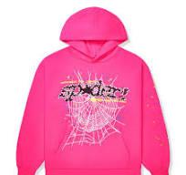
Every standout garment carries a set of design decisions that separate it from countless similar pieces on the market. The Sp5der hoodie is no exception. Beneath its immediate visual impact sits a deliberate set of choices around color, proportion, and texture that explain why it reads so differently from a typical graphic pullover.
Starting With Proportion
Before color or graphics enter the conversation, proportion does most of the initial work. The oversized, boxy fit isn't simply a nod to current trends — it functions as a canvas. A tighter, more fitted hoodie would compress the graphics into a smaller, less impactful space. The generous cut across the chest, sleeves, and hood gives the web motifs room to stretch, wrap, and breathe, allowing the design to feel expansive rather than cramped.
This is a subtle but important distinction. Plenty of oversized hoodies exist purely for comfort's sake, with minimal graphic consideration. Here, the relationship works the other way — the silhouette exists partly to serve the artwork, giving the print maximum surface area to make its statement.
Color as a Deliberate Language
Color choice in this hoodie rarely feels arbitrary. Gradients shift from one saturated tone into another — pink bleeding into orange, green fading into a deep teal — creating movement across the fabric rather than a static, flat print. That gradient technique adds a sense of energy and depth that a single solid color simply couldn't achieve.
There's also a psychological layer worth noting. Bright, saturated colors tend to command attention and signal confidence, even before any graphic detail comes into focus. Choosing these tones consistently, drop after drop, reinforces an identity built around visibility and boldness rather than the muted, understated palette so common elsewhere in streetwear. It's a color strategy that mirrors the brand's broader ethos: be seen, don't blend in.
Typography With Intentional Imperfection
The lettering across many designs avoids the crisp, clean edges typical of corporate branding. Instead, it leans toward a rougher, almost hand-drawn quality — slightly uneven strokes, dripping effects, or textures that suggest spray paint rather than digital precision. This isn't a technical limitation; it's a stylistic choice that ties the clothing back to graffiti and street art traditions, reinforcing the brand's cultural roots rather than smoothing them into something more commercially safe.
That rough-edged typography also creates a sense of individuality piece to piece, even within the same release. Small variations in how the print sits or stretches across different sizes give each hoodie a faint sense of uniqueness, even when produced as part of a larger batch.
Texture and Material Choices
Fabric selection plays a quieter but equally important role in the overall design philosophy. A heavyweight fleece interior isn't just about warmth — it also affects how the printed graphics sit and age over time. Thicker fabric holds ink and dye more effectively, helping colors stay vibrant through repeated wear rather than fading quickly into a washed-out version of the original design.
The exterior surface, meanwhile, often has enough texture to catch light differently depending on movement and angle, adding subtle dimension to designs that might otherwise read as flat under different lighting conditions.
Designing for Recognition at a Distance
One of the more practical design goals seems to be immediate recognizability, even from far away or in low-quality photos and videos. Given how much of the brand's visibility comes from social media sightings and candid photos of public figures, designs need to read clearly even when image quality is imperfect. Large-scale graphics, high color contrast, and bold linework all serve this purpose, ensuring the piece remains identifiable across a phone screen just as easily as in person.
Function Following Identity
Ultimately, every design decision in the hoodie — proportion, color, typography, texture — traces back to a single underlying goal: reinforcing a clear, consistent, unmistakable identity. Rather than treating comfort and boldness as competing priorities, the design manages to fold them together, creating a piece that feels intentional at every level rather than simply loud for the sake of being loud.sp5der
That thoughtful layering of decisions is ultimately what separates a genuinely well-designed statement piece from one that merely borrows visual noise without any real philosophy behind it.

 Arabic
 French
 Spanish
 Portuguese
 Deutsch
 Turkish
 Dutch
Dutch
 Italiano
 Russian
 Romaian
 Portuguese (Brazil)
 Greek
Greek