


What Is G7 Printing and Why Does It Matter?
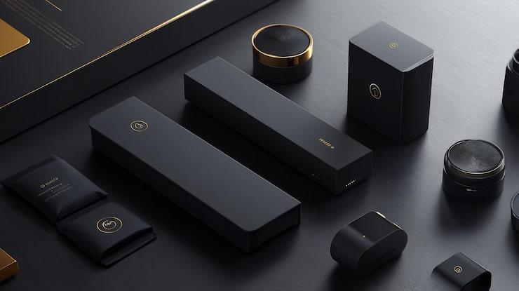
Packaging communicates long before a customer opens a product. Color, imagery, typography, finishes, and material quality all contribute to how a product appears on a shelf or in a customer's hands. When these elements need to remain consistent across different production runs, color management becomes an important part of packaging production.
G7 printing provides a methodology for achieving greater consistency in print appearance. Rather than treating color as a subjective visual decision, G7 focuses on controlling tonal relationships and gray balance during the printing process.
For packaging teams, this approach matters because a carefully developed design only delivers its intended visual impact when the printed result stays close to the approved appearance. This becomes particularly important when developing luxury product packaging, where color consistency forms part of the overall brand experience.
What Is G7 Printing?
G7 is a color-management methodology developed by Idealliance for achieving consistent visual appearance across printing processes and substrates. Its core focus includes gray balance and neutral tonality, helping printers align output with defined visual targets.
G7 does not represent a specific printing press, ink set, or printing process. Instead, it provides a method for calibrating and controlling printing conditions.
This distinction matters. Different presses, materials, inks, and production environments may produce different results. A structured color-management approach helps reduce those variations by giving production teams a consistent framework for evaluating and adjusting print output.
For packaging buyers, this means color management becomes more systematic rather than relying entirely on visual judgment.
Why Does Color Consistency Matter in Packaging?
Imagine a product line that uses a distinctive shade across cartons, labels, inserts, and promotional materials. If that color changes noticeably between production runs, the difference may affect how customers perceive the product.
Color inconsistency may also create challenges when several packaging components are manufactured separately. A carton may be printed at one facility while a label or insert is produced elsewhere. For cosmetic packaging suppliers, maintaining visual consistency across these components becomes especially important.
G7 printing helps address this challenge by creating a controlled framework for managing tonal values and gray balance. The goal is not to make every printed object look identical regardless of its material. Instead, it creates predictable, repeatable print behavior within the conditions of each production environment.
How G7 Supports Packaging Production?
Packaging production involves several stages, from prepress preparation to printing and finishing. Color decisions made early in the process influence the final printed result.
A G7-based workflow begins with appropriate calibration and measurement. Printing conditions are evaluated against established targets, adjustments are made where necessary, and output is monitored for consistency.
This process helps reduce avoidable variation. For packaging buyers, that consistency provides greater confidence when approving artwork and reviewing production samples. Instead of treating every print run as an entirely separate color challenge, teams have a defined process for maintaining alignment.
G7 also supports communication between designers, prepress teams, printers, and packaging buyers. When everyone works toward defined color targets, discussions become more objective.
How G7 Helps in Premium Packaging?
Premium packaging places particular emphasis on visual precision. A luxury package may combine carefully selected colors, typography, imagery, specialty finishes, and structural elements. A small color shift may change how those details interact.
This is where luxury product packaging benefits from disciplined color management.
A deep neutral tone, soft pastel, metallic-inspired shade, or distinctive brand color needs to appear intentional. Inconsistent reproduction may weaken the visual relationship between different packaging components.
G7 does not replace thoughtful design or finishing. Instead, it supports the printing stage by helping create greater consistency in the underlying color appearance.
This makes color management an important consideration when visual quality forms part of a product's positioning.
How G7 Differs from Simply Matching Colors?
Color matching sounds straightforward, yet print involves several variables.
Paper or board characteristics, ink behavior, press conditions, environmental factors, and finishing processes all influence how a color appears. A color that looks correct on a digital screen may not appear the same on printed packaging.
G7 addresses part of this challenge by focusing on measurable print characteristics rather than relying solely on visual comparison.
A print sample still matters, particularly when packaging uses specialized materials or finishes. G7 provides a foundation for controlling the print process, while physical proofing and production checks help confirm how the finished package looks under actual conditions.
The two approaches work together rather than competing with each other.
Why G7 Matters for Cosmetic Packaging?
Cosmetic packaging often relies heavily on visual presentation. Color plays a role in communicating product identity, product family, finish, and positioning.
A range may include several products with related packaging designs. Even subtle differences in color reproduction may make those products appear disconnected.
For cosmetic packaging suppliers, consistent color management helps create a more predictable production process when packaging components need to maintain visual relationships.
This becomes particularly useful when packaging involves multiple formats, materials, or production stages. A color-management methodology gives production teams a stronger foundation for evaluating whether output remains aligned with the intended appearance.
How G7 Use Different Packaging Materials?
Packaging rarely relies on a single substrate. Paperboard, coated materials, specialty papers, labels, and other substrates may interact differently with ink. Surface characteristics influence how colors appear, which means a design may require careful preparation for each material.
G7 does not make different substrates behave identically. Instead, it helps establish controlled print conditions appropriate to the production environment.
This distinction is important when developing luxury product packaging. A premium design may use different materials across cartons, sleeves, labels, or inserts. Each element needs to maintain its intended visual relationship without assuming that identical production settings will work everywhere.
Effective color management therefore requires an understanding of both the target appearance and the material being printed.
How G7 Supports More Reliable Color Communication?
Packaging projects often involve several stakeholders. Designers focus on visual intent. Marketing teams consider brand presentation. Packaging teams evaluate production requirements. Printers manage press conditions and output. Procurement teams consider repeatability and production efficiency.
Color disagreements may arise when each group evaluates output differently.
A defined methodology provides a shared reference point. Instead of saying that a color "looks slightly off," teams can use measurement and established targets to identify where the variation occurs. This makes troubleshooting more precise and helps reduce unnecessary back-and-forth during production.
For cosmetic packaging suppliers, this shared approach may also make communication with clients more structured when reviewing proofs, production samples, and repeat orders.
Why G7 Does Not Replace Good Design?
It is important to understand what G7 does and does not solve.
G7 supports color consistency. It does not determine whether a package has an effective design, whether its typography is readable, whether its structure protects the product, or whether its materials suit the application.
A technically controlled print process cannot compensate for weak artwork. Good packaging begins with purposeful design and continues through appropriate prepress preparation, material selection, printing, finishing, inspection, and quality control. G7 fits within this larger workflow.
This makes it a production tool rather than a substitute for creative or technical expertise.
When Should You Consider G7 Printing?
G7 becomes particularly relevant when color consistency is important across repeat production or multiple packaging components.
Consider it when:
-
A package uses distinctive brand colors.
-
Several packaging formats need visual coordination.
-
Different substrates are part of the same product range.
-
Packaging requires repeat production.
-
Multiple print processes are involved.
-
Color variation creates approval or quality concerns.
-
Premium presentation is an important part of the product experience.
The exact requirements depend on the packaging application and production environment. A packaging specialist can help determine which color-management practices fit a particular project.
The Bigger Picture: Consistency Builds Confidence
Printing quality goes beyond sharp images and attractive packaging. Consistent color helps maintain a familiar and professional appearance across batches, formats, and product lines.
For luxury product packaging, controlled color reproduction supports the impact of premium materials, finishes, and structural design. G7 provides a structured approach to color management, helping reduce variations through calibration, measurement, and tonal control.
Ultimately, strong packaging combines creative vision with reliable production. When color reflects your brand identity, consistency becomes an essential part of the customer experience.
Before production begins, establish clear color expectations across materials and print runs to achieve more predictable results.

 English
 Arabic
 French
 Spanish
 Portuguese
 Deutsch
 Turkish
 Dutch
Dutch
 Italiano
 Russian
 Romaian
 Portuguese (Brazil)