


Illustration for Children’s Books That Increases Visual Appeal and Reader Engagement
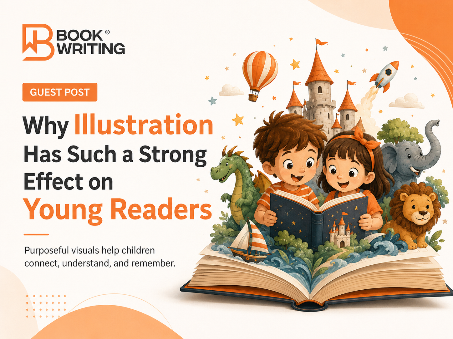
Why Illustration Has Such a Strong Effect on Young Readers
Children experience stories with their eyes long before they can analyze them with adult logic. A character’s expression, the shape of a room, the colors used in a tense moment, and even the amount of empty space on a page can influence how a child understands a scene. That makes illustration more than decoration. It functions as part of the storytelling system. When words and images support each other, the book feels easier to follow, more emotionally engaging, and more memorable.
Visual Appeal Begins With a Clear Story Strategy
Effective use of children’s book illustration services starts before the first finished scene is drawn. The illustrator or creative team needs to understand the story’s age group, tone, pacing, emotional high points, and page-turn rhythm. A playful preschool story may need bold shapes, readable expressions, and simplified environments. A more reflective picture book can support subtler color changes, richer backgrounds, and quieter compositions. The art direction should match what the manuscript is trying to make the reader feel.
This is where planning prevents expensive inconsistency. Character sheets, mood references, sample palettes, and rough page layouts give the project a visual grammar. Readers quickly notice when that consistency is missing. A character whose height, clothing, face, or proportions change from page to page can break immersion. A coordinated visual plan protects the continuity that allows the story world to feel believable.
Character Design Creates Emotional Connection
Young readers often connect to a book through its characters before they remember specific sentences. Faces, gestures, posture, clothing, and recurring visual traits make a character recognizable. Good design also considers whether emotions can be read quickly. A child should be able to understand excitement, embarrassment, uncertainty, or relief without needing a paragraph of explanation.
The most useful designs are distinctive without becoming visually confusing. A simple silhouette, signature accessory, or consistent color cue can make a character easy to recognize across different scenes. Side characters need enough individuality to feel intentional, but they should not compete with the protagonist. When these choices are made carefully, the illustrations help children track relationships and emotional development throughout the book.
Page Composition Can Guide Attention and Pacing
Every spread controls where the eye travels. A crowded composition can create energy, while a large area of open space can slow the moment and make it feel reflective. Directional lines, character placement, contrast, scale, and lighting can lead the reader toward the most important action. These tools are especially valuable in children’s books because the art often has to communicate quickly.
Composition also works with the physical page turn. A visual question near the right edge of a spread can build anticipation for what comes next. A reveal on the following page can feel larger because the previous composition prepared the reader for it. Thoughtful pacing allows the book to breathe. Not every page needs maximum detail or action. Variation between active, quiet, humorous, and emotional spreads gives the reading experience a natural rhythm.
Color Choices Influence Mood and Readability
Color is one of the fastest ways to shape emotion. Warm colors can suggest comfort, celebration, or energy. Cooler tones can support calm, mystery, distance, or nighttime scenes. The most effective palette is not simply bright; it is purposeful. Colors should help separate characters from backgrounds, keep important actions visible, and maintain enough contrast for the intended reading environment.
A controlled palette can also strengthen narrative structure. A story may begin with muted tones and gradually become more vivid as a character gains confidence. Another book may use a recurring accent color to signal an object, memory, or emotional theme. These decisions make the visual experience feel designed rather than random, and they can increase the sense of cohesion from cover to final page.
Age Appropriateness Matters in Every Visual Decision
Illustration density should reflect the developmental stage of the reader. Very young children usually benefit from clear focal points, uncomplicated backgrounds, and expressions that are easy to interpret. Older children can handle more visual layers, environmental storytelling, hidden details, and sophisticated perspective. The level of complexity should invite exploration without making the page difficult to decode.
This is one reason authors benefit from working with children book illustration experts early enough for visual decisions to influence pagination and layout. The right level of detail, character scale, text placement, and scene complexity can be planned around the actual reader rather than added after the manuscript has already been locked into an inflexible format.
Illustration and Typography Need to Work Together
Words and pictures compete for the same physical space. If art is created without considering text placement, the final layout may cover important visual information or force text into uncomfortable areas. Planning text-safe zones during sketching makes the final pages cleaner and more readable. It also prevents the designer from shrinking type simply to make everything fit.
Typography itself becomes part of the visual tone. A playful story may use friendly shapes and generous spacing, while a quiet bedtime book may call for a calmer, more restrained treatment. Whatever the style, readability should come first. The text needs sufficient contrast, appropriate size, and predictable placement so children and adults can move through the book comfortably.
Consistency Builds Trust Across the Whole Book
Readers expect the visual world to obey its own rules. Rooms should retain their key features, recurring objects should remain recognizable, and lighting should make sense from one scene to the next unless the story intentionally changes it. This kind of continuity is easy to underestimate because each illustration may look strong in isolation. The real test is whether the complete sequence feels like one coherent book.
A structured review process helps catch continuity problems before final files are prepared. Comparing character proportions, costume details, props, environment features, and color treatment across all spreads can reveal small discrepancies. Correcting those details improves polish and keeps the reader focused on the story rather than accidental visual changes.
Engagement Increases When Images Add Something New
The strongest illustrations do not simply repeat the sentence on the page. They expand it. If the text says a child walked into a garden, the image might reveal a hidden animal, a broken gate, an unusual shadow, or a humorous reaction from another character. These additions create a richer reading experience without overloading the written narrative.
Professional Preparation Supports Better Production
A visually successful book also has to survive the technical realities of production. Trim size, bleed, safe margins, image resolution, color handling, and file preparation affect how artwork appears in the finished edition. Art that looks excellent on a screen can lose important details if the file is too small or if critical elements sit too close to the trim edge.
Planning for production from the beginning reduces last-minute compromises. It gives the illustrator and designer enough room to account for gutters, cropping, and text placement. This technical discipline does not make the art less creative. It protects creative decisions so they appear as intended when readers finally hold the book.
The Long-Term Value of a Strong Visual Identity
A distinctive illustration style can support more than one book. When characters, palettes, and visual motifs are carefully developed, they can become recognizable elements across a series, promotional graphics, reading materials, and future editions. That continuity can make an author’s work easier to recognize without relying on heavy branding inside the story itself.
The value is also practical. A clear visual system makes later projects faster because key decisions about character appearance, environment style, and artistic tone have already been established. Authors who see illustration as part of long-term storytelling infrastructure are better positioned to create books that feel connected and professionally considered.
Final Thoughts
Visual appeal and reader engagement come from the same source: purposeful storytelling. Strong artwork attracts attention, but its deeper job is to help children understand, feel, predict, and remember. When character design, composition, color, pacing, typography, continuity, and production planning all support the manuscript, the result becomes more than an illustrated text. It becomes a complete reading experience.
For authors, the key is to treat visual development as an early creative decision rather than a final decorative step. Careful planning gives every illustration a reason to exist and every page a clearer role in the narrative. That approach can increase emotional connection, support comprehension, and give the finished book the visual confidence needed to hold a young reader’s attention from the first page to the last.
BookWriting.us helps authors turn children’s manuscripts into polished visual experiences through professional illustration planning, character development, page-by-page art direction, and production-ready artwork. If you want your story to look more engaging, consistent, and reader-friendly, work with BookWriting.us and let our team bring your visual concept to life.

 English
 Arabic
 French
 Spanish
 Portuguese
 Deutsch
 Dutch
Dutch
 Italiano
 Russian
 Romaian
 Portuguese (Brazil)
 Greek
Greek